Card
Examples#
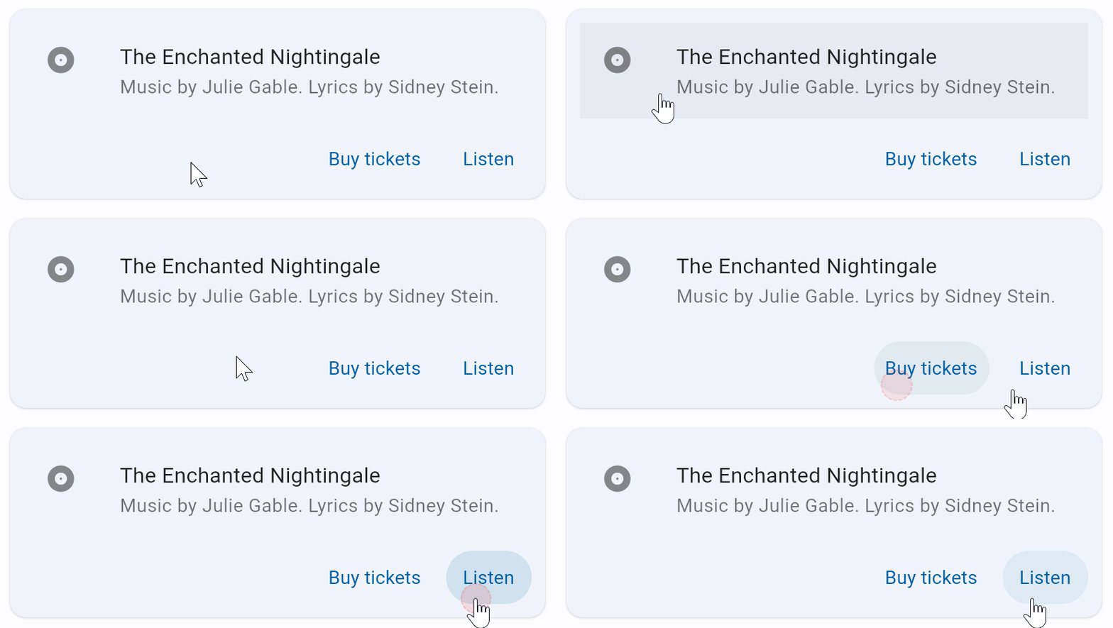
import flet as ft


def main(page: ft.Page):
    page.title = "Card Example"
    page.theme_mode = ft.ThemeMode.LIGHT

    page.add(
        ft.Card(
            shadow_color=ft.Colors.ON_SURFACE_VARIANT,
            content=ft.Container(
                width=400,
                padding=10,
                content=ft.Column(
                    controls=[
                        ft.ListTile(
                            bgcolor=ft.Colors.GREY_400,
                            leading=ft.Icon(ft.Icons.ALBUM),
                            title=ft.Text("The Enchanted Nightingale"),
                            subtitle=ft.Text(
                                "Music by Julie Gable. Lyrics by Sidney Stein."
                            ),
                        ),
                        ft.Row(
                            alignment=ft.MainAxisAlignment.END,
                            controls=[
                                ft.TextButton("Buy tickets"),
                                ft.TextButton("Listen"),
                            ],
                        ),
                    ]
                ),
            ),
        )
    )


ft.run(main)
Bases: LayoutControl, AdaptiveControl
A material design card: a panel with slightly rounded corners and an elevation shadow.
clip_behavior: ClipBehavior | None = None
Defines how the content will be clipped.
Defaults to CardTheme.clip_behavior,
or if that is None, falls back to ClipBehavior.NONE.
elevation: Number | None = None
The z-coordinate at which to place this card. Defines the size of the shadow below the card.
Defaults to CardTheme.elevation, or if that is None,
falls back to 1.0.
semantic_container: bool = True
Whether this card represents a single semantic container, or if it instead represents a collection of individual semantic nodes (different types of content).
shadow_color: ColorValue | None = None
The color to paint the shadow below this card.
Defaults to CardTheme.shadow_color,
or if that is None, falls back to [Theme.shadow_color][flet.Theme.shadow_color]
(which defaults to Colors.BLACK).
shape: OutlinedBorder | None = None
The shape of this card.
Defaults to CardTheme.shape, or if that is None,
falls back to RoundedRectangleBorder(radius=12.0).