Banner
Examples#
Basic example#
import flet as ft


def main(page: ft.Page):
    page.horizontal_alignment = ft.CrossAxisAlignment.CENTER

    def handle_banner_close(e: ft.Event[ft.TextButton]):
        page.pop_dialog()
        page.add(ft.Text("Action clicked: " + e.control.data))

    action_button_style = ft.ButtonStyle(color=ft.Colors.BLUE)
    banner = ft.Banner(
        bgcolor=ft.Colors.AMBER_100,
        leading=ft.Icon(ft.Icons.WARNING_AMBER_ROUNDED, color=ft.Colors.AMBER, size=40),
        content=ft.Text(
            value="Oops, there were some errors while trying to delete the file. "
            "What would you like to do?",
            color=ft.Colors.BLACK,
        ),
        actions=[
            ft.TextButton(
                content="Retry",
                style=action_button_style,
                on_click=handle_banner_close,
                data="retry",
            ),
            ft.TextButton(
                content="Ignore",
                style=action_button_style,
                on_click=handle_banner_close,
                data="ignore",
            ),
            ft.TextButton(
                content="Cancel",
                style=action_button_style,
                on_click=handle_banner_close,
                data="cancel",
            ),
        ],
    )

    page.add(ft.Button("Show Banner", on_click=lambda e: page.show_dialog(banner)))


ft.run(main)
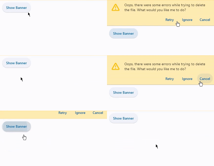
Bases: DialogControl
A banner displays an important, succinct message, and provides actions for users to address (or dismiss the banner). A user action is required for it to be dismissed.
Banners are displayed at the top of the screen, below a top app bar. They are persistent and non-modal, allowing the user to either ignore them or interact with them at any time.
| RAISES | DESCRIPTION |
|---|---|
AssertionError
|
if |
AssertionError
|
if |
AssertionError
|
if |
The set of actions that are displayed at the bottom or trailing side of this banner.
Typically this is a list of TextButton
controls.
content_padding: PaddingValue | None = None
The amount of space by which to inset the content.
If the actions are below the content, this defaults to
Padding.only(left=16.0, top=24.0, right=16.0, bottom=4.0).
If the actions are trailing the content, this defaults to
Padding.only(left=16.0, top=2.0).
leading: IconDataOrControl | None = None
The leading Control of this banner.
Typically an Icon control.
leading_padding: PaddingValue | None = None
The amount of space by which to inset the leading control.
Defaults to BannerTheme.leading_padding,
or if that is None, falls back to Padding.only(end=16).
on_visible: ControlEventHandler[Banner] | None = None
Called when this banner is shown or made visible for the first time.