CupertinoRadio
Examples#
Cupertino, Material and Adaptive Radios#
import flet as ft


def main(page: ft.Page):
    def handle_button_click(e: ft.Event[ft.Button]):
        message.value = f"Your favorite color is:  {group.value}"
        page.update()

    page.add(
        ft.Text("Select your favorite color:"),
        group := ft.RadioGroup(
            content=ft.Column(
                controls=[
                    ft.CupertinoRadio(
                        value="red",
                        label="Red - Cupertino Radio",
                        active_color=ft.Colors.RED,
                        inactive_color=ft.Colors.RED,
                    ),
                    ft.Radio(
                        value="green",
                        label="Green - Material Radio",
                        fill_color=ft.Colors.GREEN,
                    ),
                    ft.Radio(
                        value="blue",
                        label="Blue - Adaptive Radio",
                        adaptive=True,
                        active_color=ft.Colors.BLUE,
                    ),
                ]
            )
        ),
        ft.Button(content="Submit", on_click=handle_button_click),
        message := ft.Text(),
    )


ft.run(main)
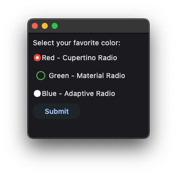
Bases: LayoutControl
A macOS-styled radio button, allowing the user to select a single option from two or more choices.
active_color: ColorValue | None = PRIMARY
The color used to fill this radio when it is selected.
autofocus: bool = False
Whether this radio will be selected as the initial focus.
If there is more than one control on a page with autofocus set, then the first one added to the page will get focus.
focus_color: ColorValue | None = None
The color for the radio's border when it has the input focus.
inactive_color: ColorValue | None = None
The color used to fill this radio when it is not selected.
label_position: LabelPosition = RIGHT
The position of the label relative to this radio.
mouse_cursor: MouseCursor | None = None
The cursor for a mouse pointer when it enters or is hovering over this radio.
on_blur: ControlEventHandler[CupertinoRadio] | None = None
Called when this radio has lost focus.
on_focus: ControlEventHandler[CupertinoRadio] | None = None
Called when this radio has received focus.
toggleable: bool = False
Whether this radio button can return to an indeterminate state by selecting it again when already selected.