CupertinoButton
Examples#
Basic Example#
import flet as ft


def main(page: ft.Page):
    page.add(
        ft.CupertinoButton(
            bgcolor=ft.CupertinoColors.LIGHT_BACKGROUND_GRAY,
            opacity_on_click=0.3,
            on_click=lambda e: print("Normal CupertinoButton clicked!"),
            content=ft.Text(
                value="Normal CupertinoButton",
                color=ft.CupertinoColors.DESTRUCTIVE_RED,
            ),
        ),
        ft.CupertinoButton(
            bgcolor=ft.Colors.PRIMARY,
            alignment=ft.Alignment.TOP_LEFT,
            border_radius=ft.border_radius.all(15),
            opacity_on_click=0.5,
            on_click=lambda e: print("Filled CupertinoButton clicked!"),
            content=ft.Text("Filled CupertinoButton", color=ft.Colors.YELLOW),
        ),
        ft.CupertinoButton(
            bgcolor=ft.Colors.PRIMARY,
            disabled=True,
            alignment=ft.Alignment.TOP_LEFT,
            opacity_on_click=0.5,
            content=ft.Text("Disabled CupertinoButton"),
        ),
        ft.Button(
            adaptive=True,
            bgcolor=ft.CupertinoColors.SYSTEM_TEAL,
            content=ft.Row(
                tight=True,
                controls=[
                    ft.Icon(ft.Icons.FAVORITE, color="pink"),
                    ft.Text("Button+adaptive"),
                ],
            ),
        ),
    )


ft.run(main)
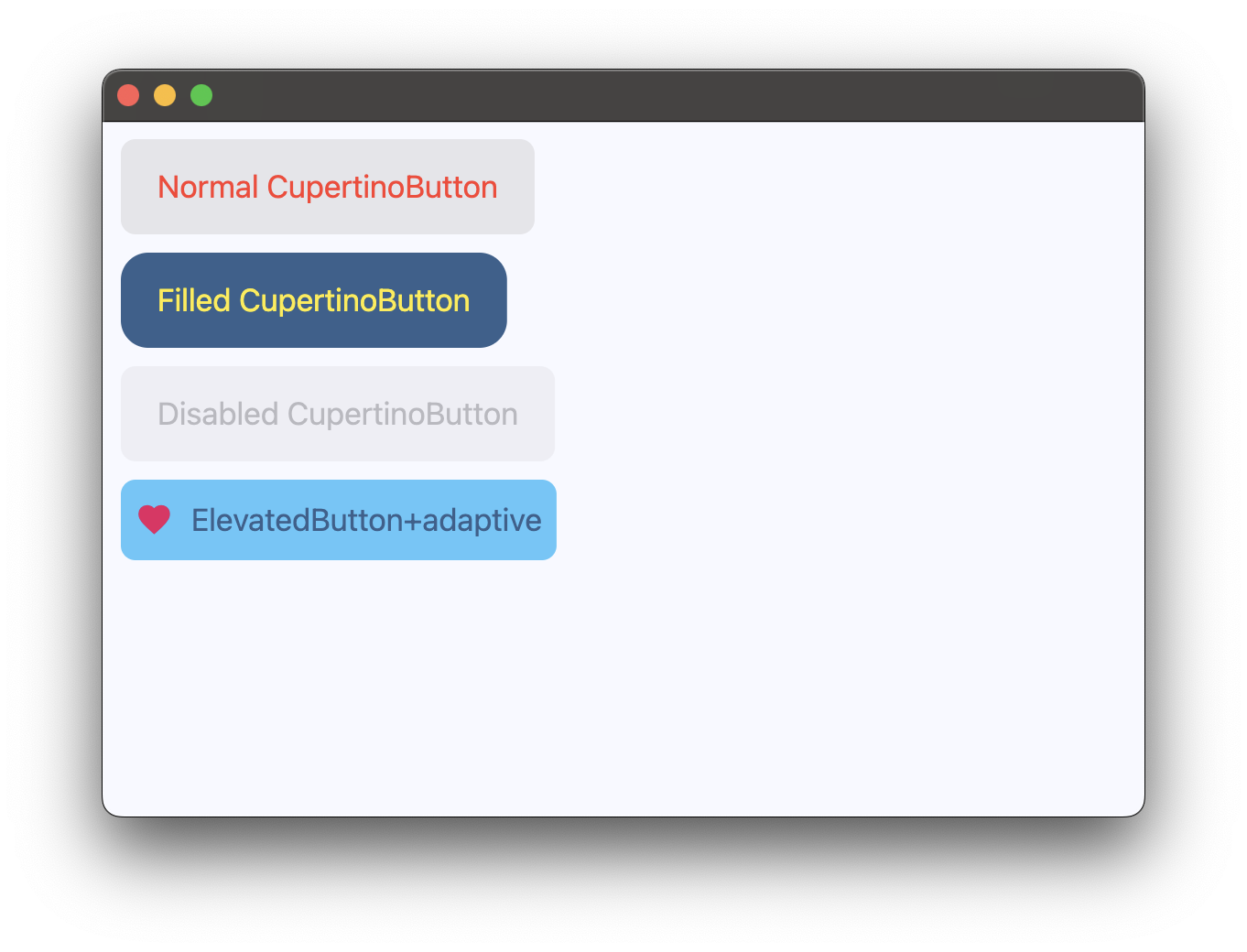
Bases: LayoutControl
An iOS-style button.
| RAISES | DESCRIPTION |
|---|---|
AssertionError
|
If |
The alignment of this button's content.
Typically buttons are sized to be just big enough to contain the child and its padding. If the button's size is constrained to a fixed size, this property defines how the child is aligned within the available space.
autofocus: bool = False
Whether this button should be selected as the initial focus when no other node in its scope is currently focused.
border_radius: BorderRadiusValue = field(
    default_factory=lambda: all(8.0)
)
The radius of the button's corners when it has a background color.
disabled_bgcolor: ColorValue | None = None
The background color of this button when disabled.
focus_color: ColorValue | None = None
The color to use for the focus highlight for keyboard interactions.
Defaults to a slightly transparent bgcolor.
If bgcolor is None, defaults to a slightly transparent
CupertinoColors.ACTIVE_BLUE.
'Slightly transparent' in this context means the color is used with an opacity
of 0.80, a brightness of 0.69 and a saturation of 0.835.
mouse_cursor: MouseCursor | None = None
The cursor for a mouse pointer when it enters or is hovering over this button.
on_blur: ControlEventHandler[CupertinoButton] | None = None
Called when this button loses focus.
on_click: ControlEventHandler[CupertinoButton] | None = None
Called when a user clicks this button.
on_focus: ControlEventHandler[CupertinoButton] | None = None
Called when this button receives focus.
on_long_press: (
    ControlEventHandler[CupertinoButton] | None
) = None
Called when a user long-presses this button.
opacity_on_click: Number = 0.4
Defines the opacity of the button when it is clicked.
When not pressed, the button has an opacity of 1.0.
padding: PaddingValue | None = None
The amount of space to surround the content control inside the bounds of the
button.