PopupMenuButton
Examples#
Basic Example#
import flet as ft


def main(page: ft.Page):
    def handle_check_item_click(e: ft.Event[ft.PopupMenuItem]):
        e.control.checked = not e.control.checked
        page.update()

    page.add(
        ft.PopupMenuButton(
            items=[
                ft.PopupMenuItem(content="Item 1"),
                ft.PopupMenuItem(icon=ft.Icons.POWER_INPUT, content="Check power"),
                ft.PopupMenuItem(
                    content=ft.Row(
                        controls=[
                            ft.Icon(ft.Icons.HOURGLASS_TOP_OUTLINED),
                            ft.Text("Item with a custom content"),
                        ]
                    ),
                    on_click=lambda _: print("Button with custom content clicked!"),
                ),
                ft.PopupMenuItem(),  # divider
                ft.PopupMenuItem(
                    content="Checked item",
                    checked=False,
                    on_click=handle_check_item_click,
                ),
            ]
        )
    )


ft.run(main)
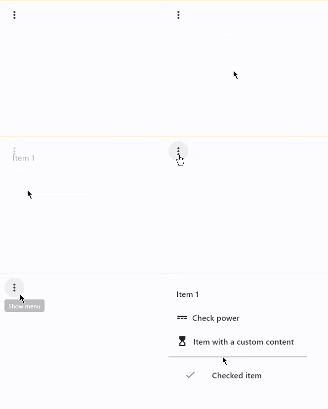
Bases: LayoutControl
An icon button which displays a menu when clicked.
clip_behavior: ClipBehavior = NONE
The content will be clipped (or not) according to this option.
content: StrOrControl | None = None
A Control that will be displayed instead of "more" icon.
enable_feedback: bool | None = None
Whether detected gestures should provide acoustic and/or haptic feedback.
On Android, for example, setting this to True produce a click sound and a
long-press will produce a short vibration.
Defaults to True.
items: list[PopupMenuItem] = field(default_factory=list)
A collection of PopupMenuItem controls to display in a dropdown menu.
menu_position: PopupMenuPosition | None = None
Defines position of the popup menu relative to the button.
Defaults to PopupMenuPosition.OVER.
on_cancel: ControlEventHandler[PopupMenuButton] | None = (
    None
)
Called when the user dismisses/cancels the popup menu without selecting an item.
on_open: ControlEventHandler[PopupMenuButton] | None = None
Called when the popup menu is shown.
shadow_color: ColorValue | None = None
The color used to paint the shadow below the menu.
shape: OutlinedBorder | None = None
The menu's shape.
Defaults to CircleBorder(radius=10.0).
Bases: Control
checked: bool | None = None
Whether this menu item is checked.
If set to True, a checkmark will be shown on the left of the
content.
content: StrOrControl | None = None
A Control representing custom content of this menu item.
icon: IconDataOrControl | None = None
An icon to draw before the text label of this menu item.
label_text_style: TextStyle | None = None
The text style of the label of this menu item.
mouse_cursor: MouseCursor | None = None
The cursor to be displayed when a mouse pointer enters or is hovering over this item.
on_click: ControlEventHandler[PopupMenuItem] | None = None
Called when a user clicks on this menu item.
padding: PaddingValue | None = None
The padding of this menu item.
Defaults to Padding.symmetric(horizontal=12).